
WMATA Tap. Ride. Go.
Naming, Brand Identity, Campaign System
Millions of Metro riders now use three simple words that didn't exist before this project.
When WMATA introduced contactless fare payment across its transit system, the technology was ready, but the public wasn't. Riders needed to understand that they could now pay with the credit card, phone, or smartwatch already in their pocket, eliminating the need for a SmarTrip card in many situations.
Working alongside the team at WHITE64, I helped transform a technical feature called Open Payment into a customer-facing campaign built around a new name I created: Tap. Ride. Go. From brand strategy and messaging to environmental graphics, advertising, social campaigns, bus activations, parking, and digital experiences, the campaign became the public face of one of Metro's biggest rider experience improvements in years.
Designer/Art Director: Matt Hodin
CD: Alex Belgrave
Copywriter: Mike Stango
Agency: WHITE64
Made throughout 2025 & 2026

THE STORY
01 – FROM FEATURE TO BRAND
Metro came to us with an exciting announcement, but not yet a campaign.
After years of relying on SmarTrip cards, Metro was preparing to introduce a major upgrade to its fare payment system. For the first time, riders could pay directly using a contactless credit or debit card, smartphone, or smartwatch, eliminating the need for a separate transit card.
Launching first on Metrorail before expanding to buses and parking, the technology promised a simpler, more seamless way to experience Metro.

Internally, the initiative was known as "Open Payment."
This was a technically accurate name that did little to communicate the benefit to riders.
Our challenge went beyond announcing a new payment method. We needed to educate millions of riders, build confidence in the technology, and create a campaign that was instantly understandable to both daily commuters and first-time visitors.
The opportunity was to transform a technical upgrade into something bigger: a recognizable, approachable brand experience.

TAP.
RIDE.
GO.
02 – NAMING THE EXPERIENCE
The biggest decision wasn't the logo. It was the name.
Rather than describing the technology, I wanted the language to describe the rider experience. Three simple actions; tap. ride. go.
Each word represents a step in the journey while also creating a memorable rhythm that's easy to read, say, and remember. Compared to "Open Payment," the new name transformed a backend technology into a customer experience.
This became the official name used by Metro across rail, bus, parking, web, advertising, and social media.
03 – DESIGNING A FLEXIBLE CAMPAIGN SYSTEM
The campaign couldn't live in one medium.
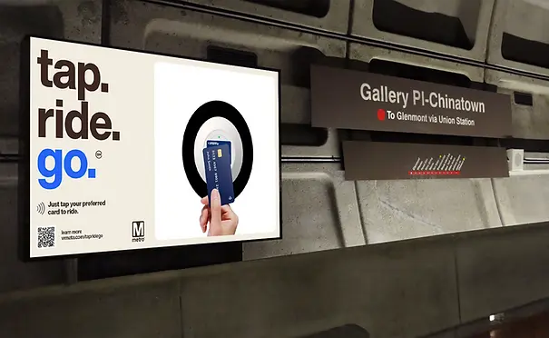
It needed to work across dozens of physical and digital touchpoints while remaining immediately recognizable.
Internally, the initiative was simply known as Open Payment, a technically accurate name that explained the infrastructure but not the customer benefit. Our job wasn't simply to advertise a new payment option. We needed to create a language and visual system that would help millions of riders instantly understand what had changed and why it mattered
That meant creating a consistent visual language flexible enough to scale from:
-
station signage
-
faregate graphics
-
fare machine wraps
-
digital screens
-
bus shelters
-
social media
-
website assets
-
parking garages
-
print
-
rider education



04 – MEETING RIDERS WHERE THEY WERE
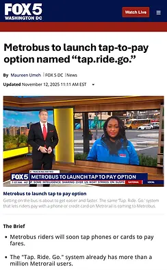
Rather than launching everything simultaneously, Metro introduced Tap. Ride. Go. in phases. The campaign evolved alongside the technology itself, beginning with rail before expanding to buses and eventually Metro parking.
Each phase introduced new rider behaviors, new environments, and new communication challenges while remaining visually connected under one campaign.


RAIL

BUS
PARKING

From Metrorail to Metrobus to parking, each phase of the rollout marked another milestone in making Metro more accessible and convenient. With news coverage accompanying each launch, Tap. Ride. Go. grew from a new payment feature into a recognizable part of the Metro experience.
05 – THREE WORDS. ENDLESS POSSIBILITIES.
Beyond introducing a new way to pay, we wanted to show riders all the places that one simple tap could take them.
Using "Go" as a creative springboard, we developed a series of animated stories connecting Tap. Ride. Go. to the experiences that make Washington, D.C. unique. From exploring the city's landmarks to catching live music or cheering on the home team, each execution gave the campaign a different personality while reinforcing the same simple message.
The result was a flexible storytelling platform that made the technology feel less like a payment feature and more like an invitation to experience the city.


One recognizable visual system. Three distinct stories. Countless reasons to ride.
06 – EXPANDING THE CAMPAIGN
As Tap. Ride. Go. expanded, we developed Pay Any Way, a social-first campaign concept celebrating the freedom and flexibility of Metro's new payment system.
Through playful messaging and engaging visuals, the campaign highlighted the different ways riders could pay, from credit and debit cards to smartphones and smartwatches, while reinforcing the simplicity of the overall Tap. Ride. Go. experience.


RESULTS
(as of May 2026)
From a new way to pay to millions of rides, Tap. Ride. Go. transformed how people move through Metro.
17M+
TRANSACTIONS
65%
METRO FACILITIES ACTIVATED
10M+
TRIPS
150K
PARKING PAYMENTS
225K
BUS TRIPS
1
VERY HAPPY CLIENT
As the campaign expanded across Metro's network, Tap. Ride. Go. became the public-facing identity for one of the largest rider experience improvements in WMATA's recent history, helping millions of customers adopt a faster, simpler way to pay.
IN THE NEWS
From local broadcasts to national publications, Tap. Ride. Go. generated media coverage as Metro introduced contactless payments across its network. News outlets including The Washington Post, WUSA9, and DC News Now helped bring visibility to the new payment experience as it expanded from rail to bus and parking.


