
Sports Williamsburg RFP
Visit Williamsburg approached WHITE64 with an exciting challenge: to brand and launch a new division called Sports Williamsburg, a destination marketing initiative designed to attract high-level travel tournaments and competitive youth sports teams to the region. The goal was to position Williamsburg, VA as a premier destination for both athletes and families. One that offers world-class facilities, endless attractions, and the charm of a historic resort town.
Our team was tasked with developing a full brand identity system, campaign concept, and visual direction to introduce this new venture to national event planners and tournament organizers. My creative direction centered around celebrating the spirit of winning, both on and off the field.
Designer: Matt Hodin
CD: Alex Belgrave
Copywriters: Mike Stango
Agency: WHITE64
Made in November of 2024

LOGO DESIGN:
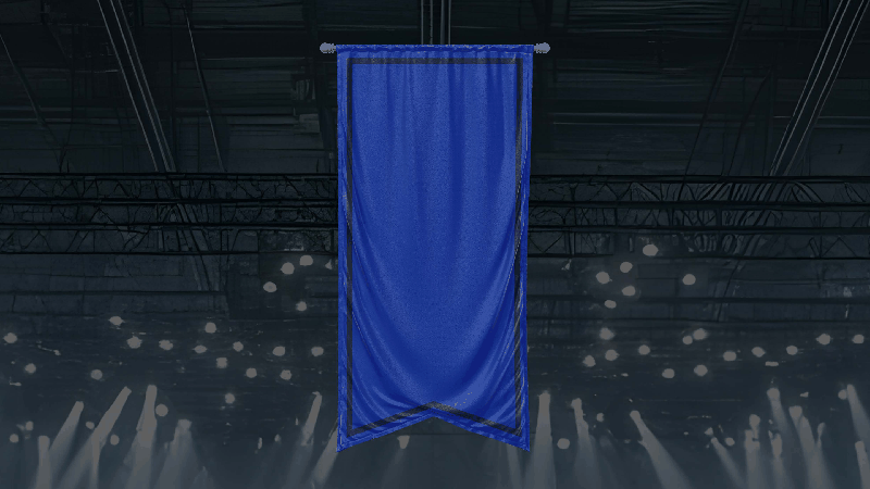
Built on the Banner of Champions
Across every arena and field, banners hang as symbols of hard-earned victories. They represent not just a single win, but the dedication, teamwork, and perseverance that lead to one. That enduring symbol of success became the foundation for the Sports Williamsburg logo.
The mark takes its shape from a classic championship banner, creating a direct link to the spirit of competition. It’s bold, confident, and instantly familiar to athletes and fans alike. Paired with clean, modern typography, the logo feels both timeless and fresh, a nod to tradition that also looks ahead to the next big win.
BRAND ICON

FULL LOGO

COLOR EXPLORATION

BUILDING OUT THE BRAND


CAMPAIGN CONCEPT:
"FOR THE W"
The integrated campaign direction — “For the W” — takes a familiar expression of triumph and turns it into a rallying cry for the destination itself. “For the W” celebrates every kind of win, from tournament victories to family memories. The tone is confident, youthful, and social — designed to resonate with athletes, coaches, and parents alike.
Each execution spotlights real advantages of hosting in Williamsburg (top-tier venues, accommodations, dining, and attractions) before punctuating the message with a bold “For the W.”


CAMPAIGN CONCEPT:
LOOK & FEEL
Visually, the campaign blends dynamic sports energy with destination-level polish. Clean typographic layouts, strong use of team-inspired motifs, and photography that captures both the action and the atmosphere — moments of competition balanced with celebration and community.
Social mockups and content examples demonstrate how “For the W” could live across digital platforms, inspiring both planners and players to see Williamsburg as the ultimate place to win on every level.


OOH CONCEPTING


DIGITAL APPLICATIONS


SOCIAL MEDIA CAMPAIGN
The For the W campaign was designed to live naturally across social media. These mockups show how the bold W banner can frame real moments of play, pride, and celebration. Each post highlights Williamsburg’s mix of top-tier sports facilities and off-the-field attractions, using authentic, energetic photography and confident captions to inspire both athletes and organizers. The result is a feed that feels aspirational, shareable, and unmistakably Sports Williamsburg.

PHYSICAL APPLICATIONS

FOR THE W PHOTO MOMENT
To bring the campaign to life at the complex, we designed an interactive “For the W” photo installation. The larger-than-life W serves as both a brand icon and a social backdrop, inviting athletes, fans, and families to capture their own winning moments. It turns the logo into an experience, encouraging organic sharing and extending the campaign from the field to social feeds.

TOURNAMENT WELCOME KIT
Every player and organizer deserves to feel like a champion, even before the first whistle. The Sports Williamsburg Welcome Kit was created as a premium mailer featuring branded swag and a personalized letter of thanks. Packaged in the signature blue with the banner-inspired mark, it sets the tone for a first-class tournament experience and reinforces the pride that comes with hosting or competing in Williamsburg — truly, a win from the start.