
Orchid Partners Brand Development
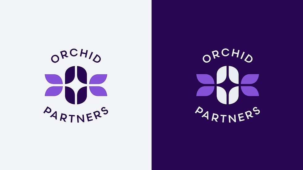
Orchid Partners' brand identity embodies sophistication, balance, and partnership. The logo’s geometric symbol draws inspiration from the organic symmetry of an orchid, blending natural elegance with a structured, modern form. Its intersecting shapes create a central core that represents unity and shared growth, serving as a visual metaphor for collaboration and connection.
A refined palette of deep violets and soft lilacs evokes trust, creativity, and ambition, while the interplay of light and dark tones reflects the firm’s dual focus on strategy and innovation. The typography, set in a clean and contemporary sans serif, complements the mark’s precision and reinforces a sense of clarity and professionalism.
Together, the identity captures a feeling of poise and purpose, creating a brand that is both timeless and forward-looking, designed to convey confidence, partnership, and enduring value.
Designer: Matt Hodin
CD: Alex Belgrave/Heather Knight
Agency: WHITE64
Made in December of 2024


BRAND ICON

FULL LOGO
LOGO BADGE

In our icon, the form of an orchid is abstracted into four symmetrical petals surrounding a central shape that symbolizes unity and shared purpose. The mirrored geometry reflects balance, partnership, and growth, while the negative space at the center represents openness and collaboration.
Viewed as a whole, the icon conveys a sense of harmony and forward momentum, expressing the idea that strength emerges from connection. Its precise structure blends organic inspiration with refined simplicity, creating a mark that feels both natural and intentionally designed.
The transition between rich violet and lighter lavender tones adds depth and sophistication, suggesting creativity, trust, and evolution. This tonal interplay gives the mark a sense of movement and vitality, reinforcing Orchid Partners’ focus on progress and partnership.


