Fearless Path Brand Development
Fearless Path is a women’s coaching brand built around empowerment, clarity, and purpose. The identity was designed to mirror that same spirit of transformation, balancing strength with softness and confidence with compassion. From color and typography to the mark itself, every element was crafted to embody growth and self-assurance, creating a visual system that feels both modern and deeply human.
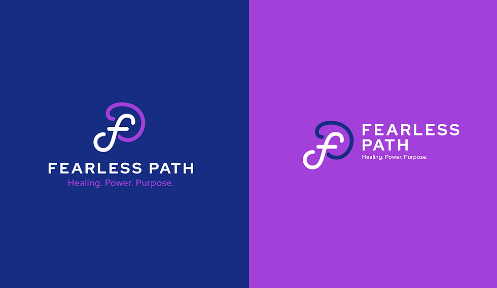
The final brand features a custom monogram that fuses the letters F and P into a flowing, interconnected form, symbolizing the journey of healing and progress. A deep blue and vibrant violet palette establishes a sense of calm strength and creative energy, while clean geometric typography reinforces approachability and focus. Together, the system communicates a brand that empowers women to rise with intention, purpose, and confidence.
Made in May of 2025


BRAND ICON

HORIZONTAL

VERTICAL

At the center of the Fearless Path identity is a monogram mark intertwining the F and P into one unified, continuous symbol. The design represents the idea of movement and transformation as a lifelong path rather than a single destination. Its fluid lines suggest grace and adaptability, while its structure conveys stability and strength.
The mark is paired with the tagline “Healing. Power. Purpose.” which anchors the brand’s mission and emotional core. Gradient treatments bridge light and depth, creating a sense of forward motion and vitality across print and digital touchpoints.